&

wordpress property websites built for Real Estate Agents
with the power of high level
now available to US Agents

Introducing 4Design – Real Estate Branding Made Simple
4Design is the creative arm of 4Property, dedicated to helping estate agents stand out in a competitive market. We specialise in creating memorable branding that works across every touchpoint – online, on the high street, and on the street. From eye-catching logos and stylish sale boards to polished websites and print-ready stationery, we deliver a consistent, professional identity tailored to your agency.
4PROPERTY CUSTOMERS
GET 35% OFF
THE COMPLETE
DESIGN PACK
Rebrand & New Customers
À LA CARTE MENU
Mix & Match Your Favorites
MARKETING ADD-ONS
€1250 for the whole package
- Custom logo design (Full-colour logo, Black & white versions (for print and mono use), Horizontal and vertical layouts Logomark icon, Delivered in multiple file formats (PNG, SVG), Print- and web-ready versions included)
- Full brand guidelines document (Logo Usage, Colour Palette, Typography, Imagery & Photography Style, Iconography & Graphic Elements, Examples of Brand in Use)
- Branded business card & letterhead design
- Email Signature Design
- Social media profile graphics
- Basic For Sale / To Let board design (print-ready)
- Window card display
- Favicon
€500 choose any 2
- Custom logo design
- Full brand guidelines document (Logo Usage, Colour Palette, Typography, Imagery & Photography Style, Iconography & Graphic Elements, Examples of Brand in Use)
- Branded business card & letterhead design
- Social media profile graphics
- Basic For Sale / To Let board design (print-ready)
- Window card display
- Favicon
- Turn great design into real results. With our 4Design add-ons, you get tailored graphics for social media, email, and online ads — all built to match your brand.
- Pair with 4Market to launch targeted campaigns using assets that are designed to perform.
- Add-ons include:
- Google Display & remarketing ad sets

Why Choose 4Design?
Property Industry Experts
We understand the estate agency world inside-out – our designs don’t just look good, they’re built to convert.
One Brand, Everywhere
We ensure visual consistency across all your materials: logo, signage, website, brochures, business cards, and more.
In-House Synergy
Work seamlessly with the same team managing your listings, CRM, and digital marketing – one partner, less hassle.
Fast Turnaround
We deliver creative work quickly and efficiently, without compromising on quality or attention to detail.
Case study
The Challenge
When Tony Wallace approached 4Design, he came with a strong concept already in mind: a lion head door knocker logo — a symbol he felt captured the qualities he wanted his estate agency to reflect. The lion represented strength, authority, and protection, while the door knocker evoked trust, tradition, and a welcoming presence.
Tony’s brief was clear: create a confident, masculine brand identity using strong, manly colours that would immediately convey reliability, credibility, and experience to clients. He wanted a look that would feel equally at home on a business card, a sale board, and the digital front page of a modern agency.
The Solution
We embraced Tony’s vision and translated it into a bold, distinctive visual identity that balances heritage with professionalism. The project included a full logo system, brand guideline document, and a high-impact For Sale sign, designed for consistency across all channels.
Logo Design
- Lion head door knocker icon: Custom drawn to reflect timeless strength and trust.
- Supplied in full colour, black, and white versions, suitable for any medium.
- Multiple layouts: horizontal, vertical, and standalone logomark to ensure maximum flexibility.
- Delivered in high-resolution and vector formats for both print and web.
Brand Guidelines
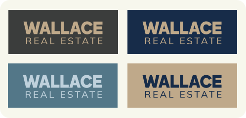
- Primary colour palette: Deep navy, charcoal grey, and rich taupe – a strong yet elegant mix to signal leadership and reliability.
- Typography:
- Headings: Poppins – a modern geometric sans serif with presence
- Body text: Muli – clean, calm and legible
- Clear specifications on logo usage, colour ratios, and typographic hierarchy.
- Practical examples for signage, social graphics, and printed stationery included for easy rollout.
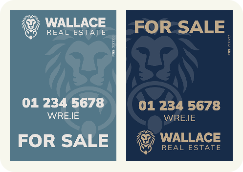
For Sale Sign Design
- Features the lion emblem front and centre, ensuring instant brand recognition.
- High-contrast layout for visibility from a distance.
- Balanced use of brand colours and clear contact information for a polished, professional impression.
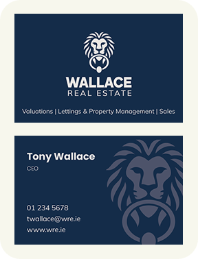
Business Card & Letterhead
- Business card: Minimalist layout with strong visual presence; clean contact layout and the lion mark featured subtly for memorability
- Letterhead: Elegant and professional; brand colours and logomark applied subtly for polish without distraction
The Result
Wallace Real Estate launched with a distinctive, unified brand that feels professional, trustworthy, and built to last. From sale boards to stationery, every element supports the same message: this is a brand you can count on.
With a refined visual identity and assets designed for both digital and traditional use, Tony now has a complete brand system that grows with his business.


Ready to stand out?
Let’s create a brand that works as hard as you do.